EstoStay brand
The e. rests on a pillow. Where every journey finds a place to rest.
The idea
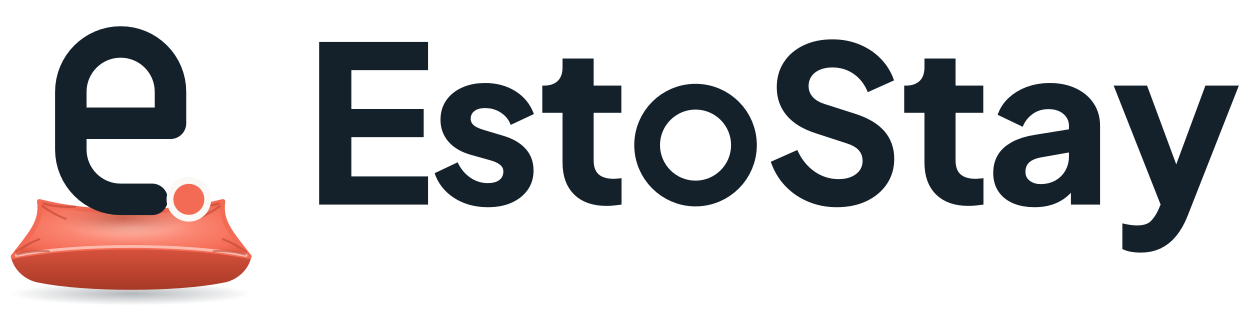
The symbol is an arched lowercase e, a doorway and the brand's initial in one line, with a coral dot where the journey arrives. It rests on a soft pillow, because the pillow is the foundation of every comfortable stay. The pillow is always underneath the e, never beside or above it. The wordmark sits to the right.
Pillow directions explored
Three ways of putting a pillow under the name were drawn and scored. The final mark keeps the pillow but puts it under the e. symbol instead, so the wordmark stays clean and the symbol works alone as the app icon.
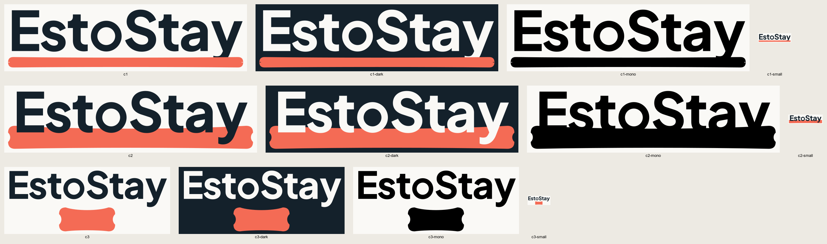
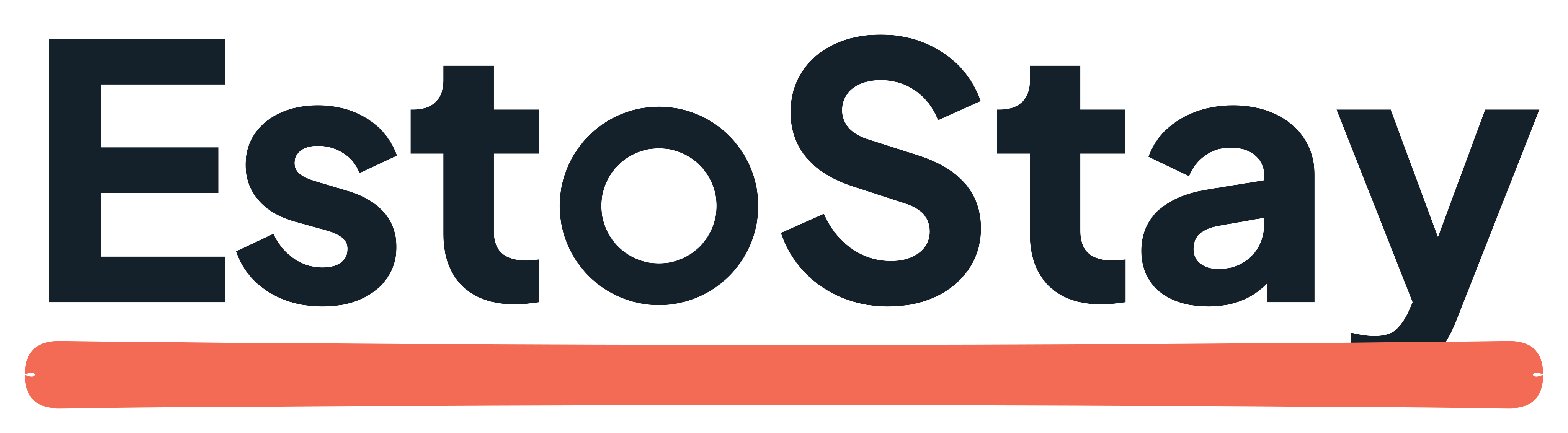
1. Pillow underline
A long, soft pillow in place of an underline.
71/100. Clean, but it reads as a coral underline before it reads as a pillow.
Scores
- Originality: 6/10
- Memorability: 6/10
- Simplicity: 9/10
- Travel relevance: 6/10
- Premium quality: 7/10
- Small-size legibility: 7/10
- Versatility: 8/10
- Differentiation: 6/10
- Longevity: 8/10
- International appeal: 8/10
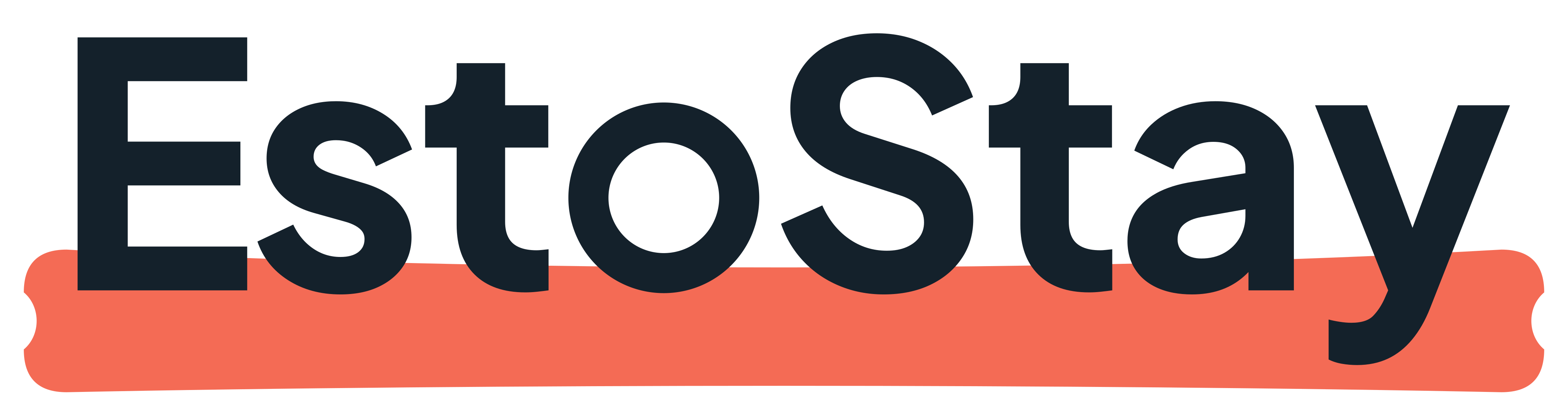
2. Resting wordmark
A full pillow the word sinks into.
65/100. Rejected. In one colour the letters sink into the pillow and disappear.
Scores
- Originality: 8/10
- Memorability: 7/10
- Simplicity: 6/10
- Travel relevance: 8/10
- Premium quality: 7/10
- Small-size legibility: 4/10
- Versatility: 4/10
- Differentiation: 8/10
- Longevity: 6/10
- International appeal: 7/10
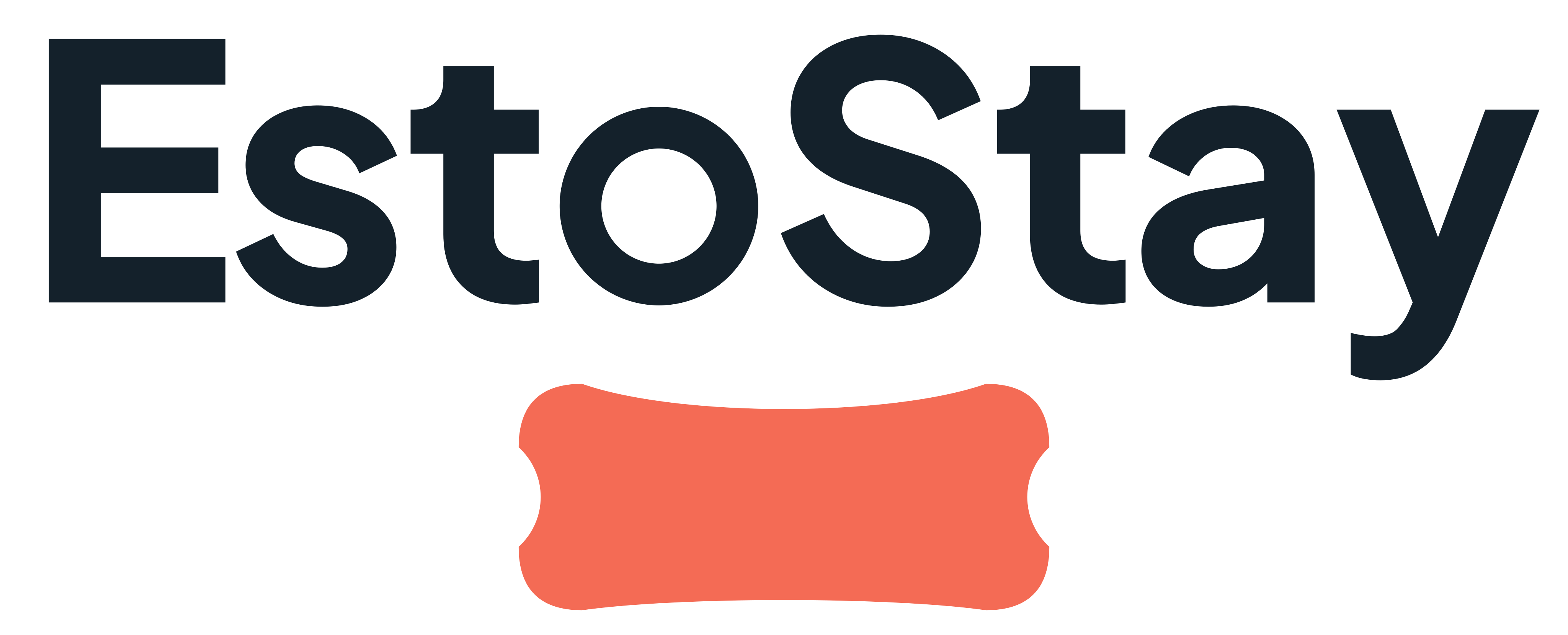
3. Signature pillow
The word on top, a compact pillow underneath.
90/100. Strongest of the three. Its pillow became the one under the e. symbol.
Scores
- Originality: 9/10
- Memorability: 9/10
- Simplicity: 9/10
- Travel relevance: 9/10
- Premium quality: 9/10
- Small-size legibility: 9/10
- Versatility: 9/10
- Differentiation: 9/10
- Longevity: 9/10
- International appeal: 9/10
The logo


Construction
The wordmark is Plus Jakarta Sans ExtraBold (SIL Open Font License), outlined, with tightened spacing and the o redrawn as a geometric ring. The e is one 6-unit stroke on a 48-unit grid, with a 3.6-unit coral dot. The pillow underneath is drawn as a real pillow seen slightly from above: a puffy top whose edges are pulled in by the stuffing, pointed ears, a darker front side with piping along the seam, creases from the ears, a dent where the e presses in, and a soft shadow underneath. The dot carries a thin ring in the background colour so it never melts into the coral. In one colour the whole e gets that ring, and the pillow is a flat silhouette. Everything is generated by scripts/brand/build.py, so every file shares the same geometry.
Clear space
Leave empty space around the logo at least as tall as the pillow on every side.
Minimum size
Logo: 28 px tall on screen, 9 mm in print. Below that, use the app icon or the favicon.
Small sizes

The symbol
The e. on its pillow stands alone for app icons and favicons.

Colour
Coral
#F46B55. The pillow. Primary actions.
Midnight Navy
#14212B. The wordmark, text, dark surfaces.
Ocean Teal
#43BFAE. Discovery and AI moments. Sparingly.
Warm White
#FAF9F6. The canvas.
Slate Grey
#66717D. Secondary text.
Coral and teal text on light backgrounds uses the deeper tones #C0432F and #17766A, which meet WCAG AA contrast.
Typography
Plus Jakarta Sans for everything. Instrument Serif italic for one or two accent words in a headline, never for body text.
Please don't
Separate the e from its pillow
Stretch or squash it
Recolour the pillow
Place it on a busy photo
Files
- estostay-logo-primary.svg
- estostay-logo-light.svg
- estostay-logo-dark.svg
- estostay-logo-on-navy.svg
- estostay-logo-black.svg
- estostay-logo-white.svg
- estostay-symbol.svg
- estostay-symbol-monochrome.svg
- estostay-symbol-white.svg
- estostay-app-icon.svg
- estostay-favicon.svg
- favicon.ico
- apple-touch-icon.png
- estostay-brand-guidelines.md
- PNG exports in /brand/png/







A visual review is not a trademark clearance. Run a proper search with EUIPO and in the target markets before registering the mark.